Showing posts with label Concept Development. Show all posts

Thursday, 29 September 2016

Asset Concept Development

Out of the above thumbnails, I chose to develop the 'pod' further, I thought it would prove to be much more challenging & interesting than the other ideas. I planned to make it like a holding cell in which the player was able to release a token or person from the cell as part of the main objective or a potential sub-quest. I got this idea from Abe's Odyseey, how you're able to free the workers throughout the game as a bonus objective.
Out of the 2 refined concepts above, I chose to continue developing the one on the left because it best fit the style in which we'd chosen to use. It would be easy to cell-shade and fit the theme of the game.
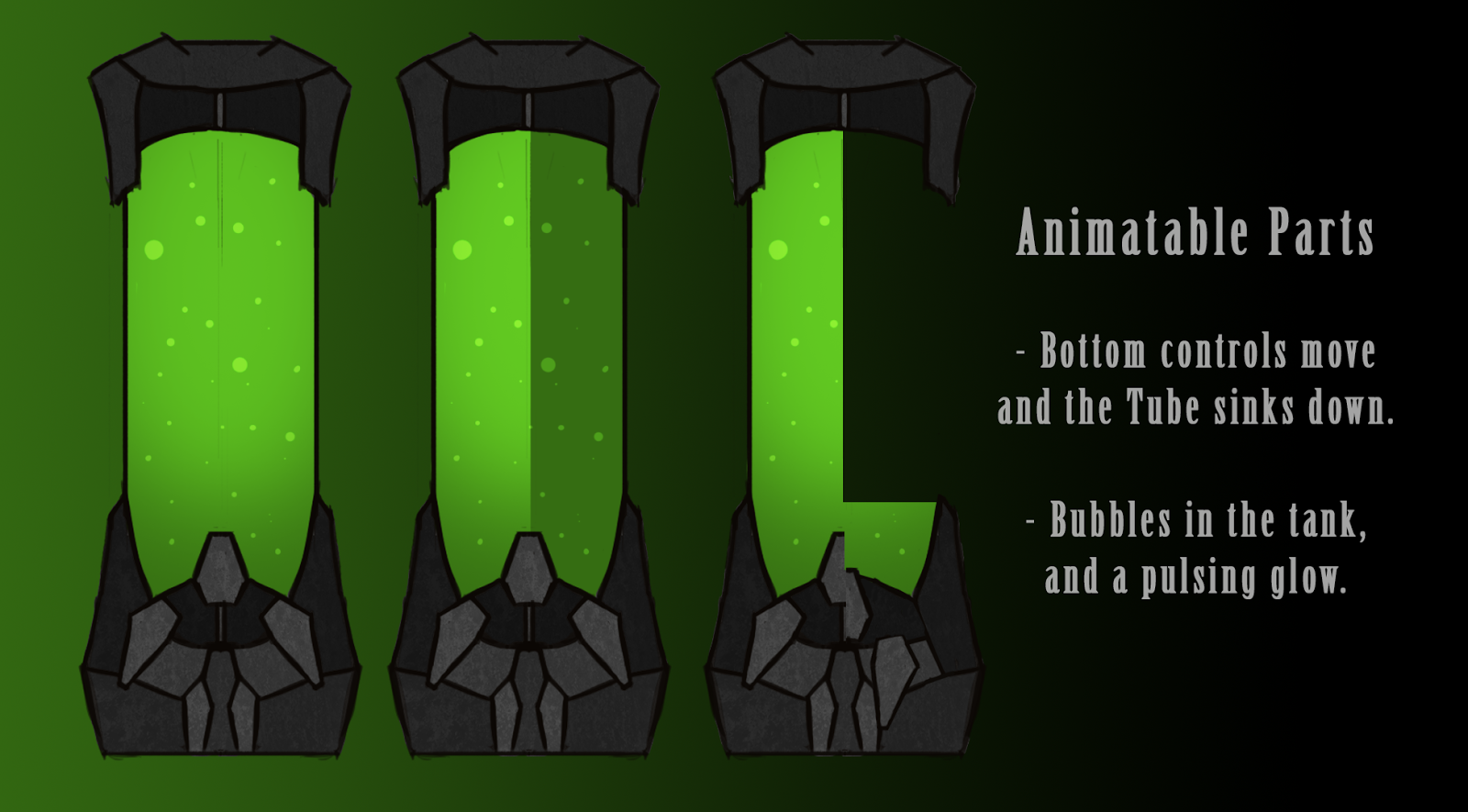
This is the final development before modelling, I adjusted the colours, dimensions and texture. I also thought about ways in which I could animate the pod. I decided to go with the idea of it opening up for an active animation, and for the idle animation to have bubbles moving inside the pod. Something to note is I didn't require a turnaround of the object to be made as it will primarily be viewed from the front, so the other sides of the object weren't as important.

Sunday, 4 September 2016

More Character Concepts

After we'd all designed our concepts for the game pitch we decided we liked Gabe's idea of a punk-rebel themed character. Jacob, Gabe and I all began to refine the concept and come up with our own renditions of how we wanted the character to look.
So these are my designs; I focused more on making the character appear punk than I did Sci-fi. I began the concept with a silhouette of the character to try and flesh out some strong shapes. After this I began to design an outfit, which I then developed as a value painting. I got some feedback on this value concept and then began to refine the concept further, changing the appearance of the character to fit the feedback given.
I'm really pleased with how this process went and am really happy with my final design.


My final concept!

Monday, 29 August 2016

Environment Concepts

For my environment concepts I was mainly focusing on the style of the environment rather than any details, once I fleshed out a style I liked I began to develop the concept as to how the game world would look.
This is my final concept for the environment, I think I captured the cell-shaded look we were hoping to achieve with this design.

Character Concepts

Thumbnails for the character design. I wanted to create a really awkward standing pose for the character.
For my character design I wanted to create a goofy looking character that looks completely out of place among the sci-fi environment. I decided to go with the pointed hat concept and refined it further. I'm happy with where the design ended up, however I primarily spent my time on the environment designs and I feel this shows, as this is far from my best work.

Sunday, 28 August 2016

Essence of Snowboarding

I wasn't entirely sure where to go with this exercise. Because my discipline is breaking the sport down into steps, I decided it'd be appropriate to create a Digimon inspired character;
And what better way to define the sport than the elusive Bogan, which lead to this monstrosity.

Friday, 18 March 2016

Team Progress & Colour Designs

I'm really happy with how everything is going within The Boiz, we're making a lot of progress and are all working really well together. Any issues we've had we were able to deal with quickly and efficiently, swapping roles and helping each other out where needed. As the director of the group I've spent a lot of time working with my team members so we can come up with the best possible designs for the conceptual stage. I've also been able to help quite a bit when it comes to the technical aspects of the project when using software such as Photoshop & After Effects.

At this stage everything we needed to have done is complete, except for the Clay Sculpture which Gabe is working on this weekend (Our old one went missing). The Animatic is complete, Jacob made it using the storyboard Gabe & Matt created. Matt also recorded and sourced sound for it while I set up the composition in after effects. And yesterday Gabe, Jacob and I took photos of the theatre to test the lighting and layout of the room (will be uploaded on Gabe's Blog).

Me & Rhys have both been working on the colour schemes for the character and have come up with a final design. Dane & Keat suggested adjusting the colour of the flesh so we're able to see more detail. We've talked this over as a group and decided that would be a good idea so we're planning on making the stomach area lighter in order to make the mechanical appendages clearer; however this will be done when we get to texturing as there's a small possibility that when the texture is applied the detail will be clear enough with this current, preferred colour scheme.
More Colour Concepts
Final Colour Scheme

Synth Overlord Character Concepts

This week I've done quite a lot of work on the concept for our 3rd character, the Synth overlord who appears on the computer monitor. 

Initially this was supposed to be Rhys' job but due to complications with the turnaround we had to adjust the schedule, putting Jacob on the animatic & Rhys on the turnaround. I picked up this extra task as I'd already completed everything I'd been allocated to do for the week and also not to overburden the others. To begin with me Gabe & Rhys all drew up thumbnail sketches and as a group we decided, once again, we all liked Rhys' design the most.

With feedback from Rhys & Gabe I polished Rhys' design and added my own touch to it (decoration on the ears, as I wanted the design to appear as if it were royalty). I then used the same colour scheme as the one that was used on the other character. We wanted the design to look like it was the same race as the other character but noticeably different and with authority over the other Synth.
During our team meeting Dane & Keat provided us with lots of feedback in regards to this character design, when I presented the design to them it was still far from finished but they brought up a lot of points I'd never even considered. The main issue they had with the design was the plain shape of the face and the fact that it wasn't recognisable as a face. They also suggested making the eye function as a camera and possibly removing a few of them as well as having the character attached to something through use of cables extending from it's head.
Gabe drew up a sketch of how he envisioned these changes, and using his design I was able to fix the concept. To do so I gave the design a cheekbone esque feature & resized the head. After removing some of the extra eyes the design was definitely lacking something so I added in the much needed piping which Gabe had also drawn in, however I went for a much simpler design as not to make the design to be too busy and to keep the main focus on the eye.
After all of this was done I began to experiment with the idea of the camera lens for the eye. Hamish suggested I do something similar to HAL 9000 after seeing my failed attempt at overlaying a camera lens vector. I really liked this idea so began to adjust the glow of the eye to match that suggestion once I was satisfied with the outcome I added a gradient outline to make the outside of the lens and the design was finished!
Final Design


Saturday, 12 March 2016

Environment Concepts & Character Colour

This week I've started trying to flesh out the cityscape for our matte painting, the main reason I'm doing it so early in the project was to help my team create a character that works well with the environment (hard to do without the environment). I've also begun sourcing images for the matte painting and even made a flickr account for my team.
City-Doodle whilst helping with the storyboard
POV Sketch from after the Matte Painting tutorial
Photoshop practice, photo from: www.flickr.com/photos/quandt/23101096024/

Painting layout practice
I've also been working quite closely with Rhys since he was the one designing the character for the most part. With input from everyone in the group we came to a decision on the final character and Rhys was able to come up with an awesome design, which we were all happy with. To help him out a bit, and anyone else who wants to try their hand at it; I created a colour template using his illustration, making it really easy to change the colour scheme.
Colour concepts of  Rhys' character

Tuesday, 8 March 2016

Environment Concepts


Some thumbnail designs I did for the shapes of the buildings


I made a set of colour palettes, once we decide what scheme to use I'll create another set.

Sunday, 6 March 2016

Style Concepts

A really quick painting of the cityscape with the colour scheme/shapes I was envisioning.

This is how I was imagining the Robot's point of view would look.

Monday, 27 July 2015

Concept Development Completed!

Finished with concept development!

The feedback I received from my lecturer was overwhelmingly positive & the only element he suggested I change is to simplify the Chicago typewriter prop to make it easier to model.

Sunday, 26 July 2015

Swatches


These are all possible textures, however I will need to see how they look on a completed 3D model to make a final decision.

Props

Props designed for Salvatore
Violin case & Chicago typewriter (Thompson gun)


Character Profile

Character Bio:

Salvatore is a 1920s mobster of Italian descent. 
His family were murdered in an act of arson by a rival Mafia gang.
Fuelled by blind rage Salvatore tracked down the rival gang however he was brutally murdered in a similar fashion to that of his family; burnt alive in an interrogation chamber.
Nearly a century later Salvatore is back & out for revenge, reincarnated in his original body, neither living nor dead. Salvatore's form is of that from the moment of his death, wearing a torn suit & rubber mask to resemble his melted face which has now decayed entirely. 
Now that the Mafia has been officially retired, and all of his old rivals either dead or knocking on death's door; Salvatore is now hunting down the predecessors' families to finally avenge his own family's death,


Salvatore - The Italian name Salvatore means - "savior."

Props:
Chicago typewriter (Thompson gun) carried in a violin case.

Age:
Born 130 years ago, died at the age of 32, so physical age of 32.

Nationality:
Italian.

Occupation:
Deceased Mafia mobster.

Summary of Sequence

Summary of Original:

The original sequence I am adapting is from Point Break, a crime film based on a series of bank heists. The sequence I will be using from this film is from the beginning of the heist scene, which the bank robbers climb out of the van and storm the bank. I will also be using the segment where one of the characters raises a gun as he requests the vault be opened.

Summary of Adaptation:

I will be changing this scene to the horror genre, making it so my character is hunting down an isolated victim as an act of revenge. The character will be seen from a distance, slowly approaching but never physically moving, standing there in an intimidating pose. (inspired by slender man). The perspective will be from that of the victim, they will be trying to evade this masked figure however as they begin to panic more & more he closes in and appears in front of them, licking the lips of the mask (from Point Break). He then raises his gun which was produced from a violin case, slowly says a piece of dialogue and raises his gun to shoot the victim down.

Textures


Texture Research

Pin Stripe:
Herringbone:
Sharkskin:
Serge:


Saturday, 25 July 2015

Expressions

I'm now a year wiser and decided to utilise this by doing a few different head angles & lighting examples. This is my version of an expression sheet, due to the character wearing a mask and therefore incapable of displaying emotion via expressions.


Check list is getting shorter:

- Poses & props
- Completed turnaround with Biography